Infographics and the attention span
 It’s really a shame that the infographic is dying off (reports FastCompany in this recent article: What Killed the Infographic?) or, as they eventually reveal, not so much dying off as retreating into internal data science reports. As most of us are visual learners, the ability to hook a reader in the first few seconds with a visual is usually an effective means of getting them to read your content. Anecdotally, I’ve seen that content with gorgeous imagery performs better – as in, you see a lift in time on site and page depth. On the flip side, content sans imagery does terribly. You’re lucky if you can maintain a 50% bounce rate.
It really makes me wonder if society is moving closer and closer to how it is portrayed in Idiocracy. We’re already watching our phones with the attention a mother gives her newborn. A friend remarked to me the other night how he noticed his attention span during a movie recently: the least bit of a slowdown and he whipped his phone out to check baseball, catch up on Facebook, and wait for the movie to pick back up again. No wonder blockbuster action thrillers win at the box office and cerebral think-pieces tank. I’m guilty of obsessive internet-checking too, although I like to think I’m avoiding commercials more than waiting for a plotline to thicken.
There’s a place for infographics on the web, though, we just need to think of them as more than data visualization. What is Instagram if not one long, scrolling infographic on life?
How’s this to catch your attention? The below is an illustration of all the ocean currents in the world. Data, meet art. (Aside: there’s a Star Trek reference in there somewhere, there has to be…)
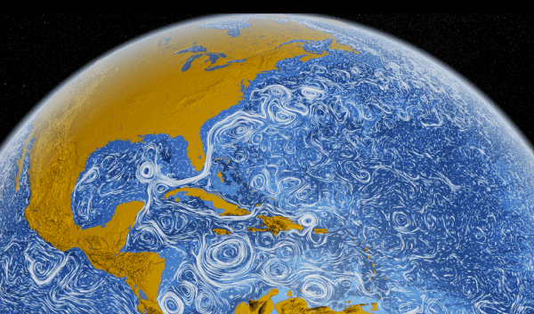
Nasa visualizes all the world’s currents – http://www.fastcodesign.com/1669361/better-than-a-van-gogh-nasa-visualizes-all-the-worlds-ocean-currents

